
Finding new information in unlikely places.
Finding new information in unlikely places.
The long-standing paradoxical debate in historic preservation between the values-based approach and the fabric-based has always irked me. An attempt was made in the last few decades to address this question by proposing/introducing an economic perspective to the debate: “What is it worth and to whom?”
However, this method, as far as I have been able to tell, has fallen short of the big picture: the value here to be quantified is not monetary–for that is easy enough to do, but is ultimately superficial when it comes to assessing historical value. It seems that in our day and age this is the first round out of the gun when it comes to valuation, “How much does it cost and how does that equate to value?” The idea is subjective in itself, it is predicated on there being an evaluator.
Is it possible to remove the bias? Is it possible to determine what people en masse think about an object and what kind of values they attach to it without influencing this very personal, inner process?
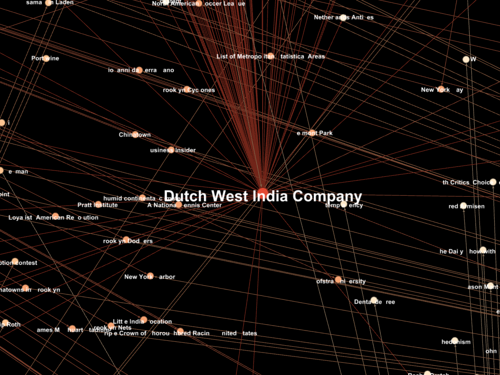
One way is to tap into the vast sea of social media data, that with a little time and practice is readily available to virtually anyone. This is the idea behind Big Data: how companies, governments, organizations and the like track interest, epidemics, trends, and just about anything else there is to track. Want to know how popular your website is? Want to know how well your product is doing compared another company? Want to know how popular North Brother Island is in New York City, and what people are saying about it (this is the our studio site/topic this semester)?
Although this method does come with its own drawbacks, it’s power comes from its unbiased and infinitely queryable nature. Even the traditional method of surveying is flawed when it comes to this: only a certain population will be open to a survey (think of all those green peace folks you’ve passed on the street); and of those who actually accept to be surveyed, the act of surveying itself ultimately influences their behavior (think of the observer effect). This relationship is nonlinear and, for all intensive objective purposes, unpredictable.
Twitter, Instagram, Facebook, Flickr, etc. can all be used to gauge interest as a value of an object. Along with sources such as Wikipedia it is also possible to very quickly establish an accurate and vast stakeholder network that extends beyond the rational typically applied to such a resource. Typically, we look at these relationships in a single dimension, meaning with only a single degree of separation. Using the power of big data, it is possible to start with an initial topic and expand it to 2 or more degrees of separation, in turn creating an exponentially larger relationship network including topics/stakeholders/etc. one would never have been able to predict (well beyond the bounds of human capability).

The image below is a single search on Wikipedia for “North and South Brother Islands” with 1.5° of separation. Below it are some of the particular nodes of interest to the project. All obtained within minutes.


Given the right parameters, this method could also be used to very quickly provide an interactive and dynamic map of an object’s history that could be made available to those interested. It can also be used to track the behavior of a particular intervention or realized plan that has been recently implemented. These results can be displayed in real-time and by geographic location (given that the geographic data is available; only ~6% of Tweets, for instance, are geotagged).
The possibilities are endless, and invaluable to a progressive valuation method in contemporary historic preservation.
Here is an interesting article discussing the possibilities and benefits of Big Data methods/tools.

So much going on this semester–too much perhaps? Never.
As part of an independent study I have created this semester, I’ve begun research into writing python components in grasshopper. The study deals with at-risk adobe structures in New Mexico, at the Fort Union National Monument, and developing a methodology for correlating historical climatological data to deterioration reports in the effort to establish patterns of deterioration that may helpful today to assessing the risk these structures face.
I’ve begun toying with the idea, thanks to the help of Professor Mostapha Sadeghipour Roudsair (who is co-sponsoring the study along with Professor Frank Matero), of creating a plugin for grasshopper that incorporates the hygrothermal analysis capabilities of WUFI. What is potentially quite powerful is the ability to recreate past meteorological scenarios (the site has exquisite and meticulous weather data dating back to 1895) and study the pathologies of the structures by cross-referencing historical photos and accounts. Using the same method then, today it would be possible to begin a recording campaign that corresponds real time, onsite weather data with such analysis. And in assessing future risk, it is then possible to predict such pathologies into the future by studying and establishing past and current deterioration mechanisms as they are directly related to climatological factors (wind, precipitation, groundwater rise, etc).
It’s looking like this will be my thesis. 1/3 Environmental Building Design, 2/3 historic preservation, which was the model that had been agreed upon for my thesis when I was granted the opportunity to pursue these degrees. What’s most exciting is to see people and professors from both departments exciting about the same topics and learning new things & methods never thought possible.
Anyway, more to come…

I came across the article recently, and if you’re an architect, environmental designer, and/or termite enthusiast you might find it just as fascinating as I did. Apparently, it’s been a topic and biomimetic precedent that has been under investigation for some time. New tools and monitoring techniques have shed some new light recently, however. A more detailed journal article has been published by Hunter Kinga, Samuel Ockob, and L. Mahadevana under the title “Termite mounds harness diurnal temperature oscillations for ventilation” and can be accessed through Penn Franklin.
Worth a read…
Here is a more detailed abstract from that journal:
Many species of millimetric fungus-harvesting termites collectively build uninhabited, massive mound structures enclosing a network of broad tunnels that protrude from the ground meters above their subterranean nests. It is widely accepted that the purpose of these mounds is to give the colony a controlled microclimate in which to raise fungus and brood by managing heat, humidity, and respiratory gas exchange. Although different hypotheses such as steady and fluctuating external wind and internal metabolic heating have been proposed for ventilating the mound, the absence of direct in situ measurement of internal air flows has precluded a definitive mechanism for this critical physiological function. By measuring diur-nal variations in flow through the surface conduits of the mounds of the species Odontotermes obesus, we show that a simple combina-tion of geometry, heterogeneous thermal mass, and porosity allows the mounds to use diurnal ambient temperature oscillations for ven-tilation. In particular, the thin outer flutelike conduits heat up rapidly during the day relative to the deeper chimneys, pushing air up the flutes and down the chimney in a closed convection cell, with the converse situation at night. These cyclic flows in the mound flush out CO2 from the nest and ventilate the colony, in an unusual example of deriving useful work from thermal oscillations.

This project grew out of an investigation into lighthouses as a historical building typology and the reasons for their failure. As portion of the focus of our final project in Building Pathology, what was discovered was that more often than not historic lighthouses today fail due to a lack of maintenance. At their heyday, lighthouses were manned 24 hours a day and maintained 24 hours a day: making sure pooled water on sashes was wiped up, ensuring broken windows were repaired, and ensuring weather-tightness of the structure in general. When the modern era replaced this antiquated system of navigation, this maintenance was indefinitely deferred, which ultimately leads to their failure in some way or the other.
I posed the question about redefining the lighthouse typology by embracing modern methods and techniques to optimize form to account for this unfortunate yet inherent idiosyncratic design feature.
Briefly, the premise was to remove the previously necessary maintenance input into the typology and rely purely on form to provide the navigational guidance toward prominent shipping lanes by redirecting the sun’s rays at critical moments during the day and year. So, instead of a lighthouse what is created is a reflective obelisk. By analyzing the predominant shipping lanes in the area and weather data for the year the form could be optimized by: rotation, twist, height, concavity/convexity, and translation of the top relative to the bottom of the tower.


I was able to then assign which surfaces were to be reflective or not. The process was repeated in three different locations world-wide: Cape May, NJ USA; Hel Peninsula, Poland; and Isola del Giglio, Italy.


The full report can be viewed here in detail, which goes on to describe the full methodology including genetic algorithm methods used as well as the results in finer detail. It should also be mentioned that this project is not an end-all-be-all ‘solution,’ rather an example of how it is possible to dovetail new technologies and methods with age-old questions. If anything, it is a project that at the end poses yet more questions.


Here the nodes are separated by category of connection and each ‘edge’ or connection is labeled with a year. The same data can be organized multiple ways by sorting and filtering certain data sets.
This project is a spontaneous offshoot of the research that I have been doing for Michael Henry, which is focusing on establishing Thomas Jefferson’s knowledge of environmental architectural design throughout the conception, execution, and modification of Monticello.
It all began with the suggestion from Prof. Henry that it might be beneficial to create something like a “LinkedIn” diagram for Mr. Jefferson to begin to understand what he knew, where he might have learned it, and who he might have learned it from. I started this task manually using Illustrator. This initial diagram began as a circular chart of sorts, starting with a nexus being Thomas Jefferson and radiating outward by year, and divided into ‘hemispheres’–the top half being Europe, the bottom being the United States. This was utterly time consuming, and frustrating on the mind-numbing level to know that as research progressed I would have to redraw this chart. Each time. I found it incredibly hard to believe that there was no easier way, more specifically no parametric way that would streamline research and visualization simultaneously.
A long spring break later, I came across a way to begin organizing the data that I had already found in the form of citations, etc. and visualizing it. I turned to to the same methods and software that is being used to organize and visualize Big Data, such as social networks and google searches, to solve this.
***


I first found a project being undertaken by Harvard called Visualize Historical Networks which attempts much of the same thing using a software, I believe, called Gephi–which uses Java and other things I don’t yet understand to begin to visualize adjacency at a specific time and extended periods.
I came across a plugin for excel that allowed me to do this quickly and easily (as this in itself is not part of my research) using my Endnote database. It is currently limited in its scope, ability to modify parameters, and export options however not totally limited. I have already drafted a proposal to expand this research using some creative scripting to communicate between programs, MatLab, and a brute-force method for harvesting historical data from large digital databases (Library of Congress ,etc.).

Adjacency matrix from excel, which can then be used in MatLab to perform much more powerful computations. This is the data language of such networks.
We’ll see where this goes, time permitting!
I’m taking the opportunity to apply some new software (ScanAndSolve™) to begin to visualize some of the potential mechanics involved with a 19th century cast iron element atop a masonry structure that is part of a project for the Building Pathology class I am in this semester with Prof. Michael Henry.
It should be noted that this is only a tool, and even this entire portion of the project–that being the analysis of possible structural failure mechanisms–is but a very small piece of the puzzle. In fact, it merely represents the final stage; a thorough investigation must be first done of the system as a whole that takes into account the construction, material properties, material adjacency, maintenance history, weather data, to name but a few.
To that, SnS™ offers this disclaimer:
“Scan&Solve(tm) Results
Design decisions require experimental data and substantial experience; they should never be made based solely on a software simulation. Simulation is not intended to replace physical testing of prototypes, which is required to validate any design.”
To be very honest, I just wanted to try out this new toy after applying for the student license (which ScanAndSolve™ was quite happy to do, unlike many other companies that make the process difficult).
More to come!
The images below map the principle tension and compression forces in lb/ft^2. Malleable Cast Iron was used as the material (only 2 offered at the moment, the other which is nodular was not invented until 1943 and would not have been used here)
E+ 3.551e+09 lb/ft^2 Sut= 7.10105e+06 lb/ft^2 rho= 1.430e+01 slug/ft^3
Here is a quick description of the software and its comparison to traditional FEA (finite element analysis:
“Scan&Solve™ for Rhino for Windows completely automates basic structural simulation of Rhino solids. Unlike other analysis tools, no preprocessing (meshing, simplification, healing, translating, etc.) is needed.”

Essentially its an incredibly fast, streamlined, and easy-to-apply software to be applied quickly, multiple times though a design process to visualize the system. It’s not perfect, no program is–even the stand-alone, multi-thousand dollar ones, aren’t–but I’ve found it to be quite helpful.
Anyway, go check it out for yourself.

In front of Meyerson Hall
MEBD class photo from Arch754 Performance Design Workshop a few weeks ago. We had the opportunity to get our hands on a Fluke IR thermal camera and take a look at buildings on campus. Specifically we were looking at potential points of weakness in the envelope (windows, corners and edges, etc.), and just how facades perform in general thermally. I’ve also had some experience with the IR camera for HSPV516 Building Diagnostics. The camera belongs to the facilities department at UPenn, and they typically use it to quickly identify overheating transformers, fuses, and the like.
I won’t say where I am in the lineup, but it should be pretty obvious.
And here is a closeup of the device, produced by Fluke, that we were using.


I found myself token-less and running late for a meeting the other day, and so forced to walk I happened across this site, which stopped me inquisitively and delightfully in my tracks. Can you spot the potential building diagnostics nightmare? I couldn’t resist formulating a narrative in my head about how this happened and more importantly how this might be affecting the building. A wider angle of this photo would show that this location appears to be the shortest distance from the Subway loading dock/area to the street curb. Why walk more than you have to, right? Rain and snow melt naturally find their way down the downspout, efficiently convert their potential energy to kinetic, and shoot straight into the back of that trash can wheel (about 2″ away). The water splashes, forms small droplets, which freeze on contact with the metal downspout effectively sealing it. Aside from the localized moisture source potentially leading to moisture migrating into the wall at grade or below, it remains to be seen what kind of damage can be incurred as a result: added weight on the fragile downspout fasteners leading to detachment? Added weight of the ice pulling the downspout free of its connection with the gutter at roof level? Imagine if the whole wasn’t there, and the entire downspout filled with ice–it could easily detach with the weight of several hundred pounds of ice and harm or seriously injure passersby. Or even simply sealing the garbage can lid shut with ice, offering the garbage man the little-needed motivation to not take out the garbage? Any others?
The most powerful tool you have in diagnosing any problem is observation, taking in the ‘lay of the land.’ Blame is typically and generously applied to the architect, the engineer, the contractor, etc. However, user error can often be the most impacting factor when it comes to the degradation of buildings. Water is the moist dangerous element to buildings, it will ultimately always find a way in or around an obstacle. The question here is, in suite with the unfolding scene above, is the whole intentional? Could very easily see a building maintenance person stabbing the whole rather than freeing the downspout of ice (in defense of building maintenance men, is most likely is unintentional).
Lesson here? Walk every now and then, you might learn something. And keep your eyes ever-peeled.
I have to say, during my five years in undergrad in architecture school and the two years after that working in the practice, triangulating field drawings was something I had always heard about but never actually did. First year undergrad students at IIT had the opportunity of taking an actual surveying class in the school of civil engineering (a class I absolutely regretted not taking), but alas…
Well, I was lucky enough to get a chance to learn how to triangulate in theory and in practice for a project I am working on in documentation (HSPV 601: Research, Recording, and Interpretation II). The task is to essentially measure, document, and recreate in CAD the courtyard between Meyerson Hall and the Fisher Fine Arts Library ( 39°57’6.93″N 75°11’34.25″W).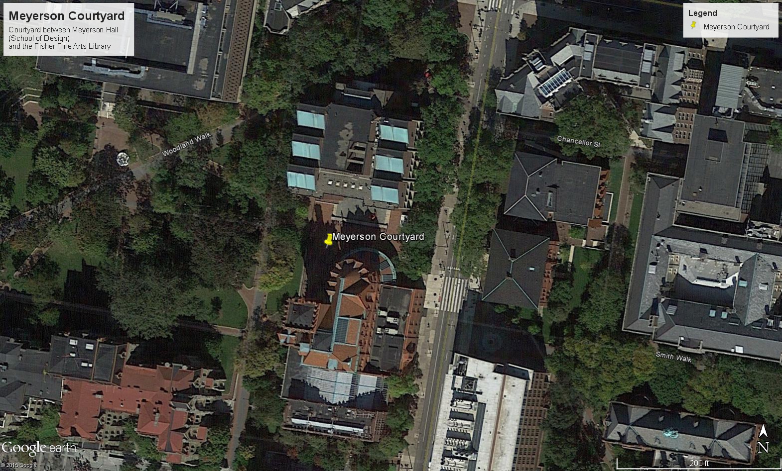
And despite my skepticism of achieving acceptable accuracy pulling tape in excess of 100’+, the drawing came out quite accurate (within 3/16″).
It made for quite an interesting drawing overlay as well.

